Toute l'actualité de l'intelligence artificielle, du machine learning et du Big data dans le média Towards Data Science
What Is a Latent Space?
A Concise explanation for the general readerPhoto by Lennon Cheng on UnsplashHave you ever wondered how generative AI gets its work done? How does it create images, manage text, and perform other tasks?The crucial concept you really need to understand is latent space. Understanding what the latent space is paves the way for comprehending generative AI.Let me walk you through few examples to explain the essence of a latent space.Example 1. Finding a better way to represent heights and weights data.Throughout my numerous medical data research projects, I gathered a lot of measurements of patients' weights and heights. The figure below shows the distribution of measurements.Measurements of heights and weights of 11808 cardiac patients.You can consider each point as a compressed version of information about a real person. All details such as facial features, hairstyle, skin tone, and gender are no longer available, leaving only weight and height values.Is it possible to reconstruct the original data using only these two values? Sure, if your expectations aren't too high. You simply need to replace all the discarded information with a standard template object to fill in the gaps. The template object is customized based on the preserved information, which in this case includes only height and weight.[Photograph of the author taken by Kamil Winiarz]Let's delve into the space defined by the height and weight axes. Consider a point with coordinates of 170 cm for height and 70 kg for weight. Let this point serve as a reference figure and position it at the origin of the axes.Moving horizontally keeps your weight constant while altering your height. Likewise, moving up and down keeps your height the same but changes your weight.It might seem tricky because when you move in one direction, you have to think about two things simultaneously. Is there a way to improve this?Take a look at the same dataset colour-coded by BMI.The colors nearly align with the lines. This suggests that we could consider other axes that might be more convenient for generating human figures.We might name one of these axes ‘Zoom' because it maintains a constant BMI, with the only change being the scale of the figure. Likewise, the second axis could be labeled BMI.The new axes offer a more convenient perspective on the data, making it easier to explore. You can specify a target BMI value and then simply adjust the size of the figure along the ‘Zoom' axis.Looking to add more detail and realism to your figures? Consider additional features, such as gender, for instance. But from now on, I can't offer similar visualizations that encompass all aspects of the data due to the lack of dimensions. I'm only able to display the distribution of three selected features: two features are depicted by the positions of points on the axes, with the third being indicated by color.To improve the previous human figure generator, you can create separate templates for males and females. Then generate a female in yellow-dominant areas and a male where blue prevails.As more features are taken into account, the figures become increasingly realistic. Notice also that a figure can be generated for every point, even those not present in the dataset.This is what I would call a top-down approach to generate synthetic human figures. It involves selecting measurable features and identifying the optimal axes (directions) for exploring the data space. In the machine learning community, the first is called feature selection, and the second is termed feature extraction. Feature extraction can be carried out using specialized algorithms, e.g., PCA¹ (Principal Component Analysis), allowing the identification of directions that represent the data more naturally.The mathematical space from which we generate synthetic objects is termed the latent space for two reasons. At first, the points (vectors) in this space are simply compressed, imperfect numerical representations of the original objects, much like shadows. Secondly, the axes defining the latent space often bear little resemblance to the originally measured features. The second reason will be better demonstrated in the next examples.Example 2. Aging of human faces.Twoday's generative AI follows a bottom-up approach, where both feature selection and extraction are performed automatically from the raw data. Consider a vast dataset comprising images of faces, where the raw features consist of the colors of all pixels in each image, represented as numbers ranging from 0 to 255. A generative model like GAN² (Generative Adversarial Network) can identify (learn) a low-dimensional set of features where we can find the directions that interest us the most.Imagine you want to develop an app that takes your image and shows you a younger or older version of yourself. To achieve this, you need to sort all latent space representations of images (latent space vectors) according to age. Then, for each age group, you have to determine the average vector.If all goes well, the average vectors would align along a curve, which you can consider to approximate the age value axis.Now, you can determine the latent space representation of your image (encoding step) and then move it along the age direction as you wish. Finally, you decode it to generate a synthetic image portraying the older (or younger) version of yourself. The idea of the decoding step here is similar to what I showed you in Example 1, but theoretically and computationally much more advanced.The latent space allows exploration into other interesting dimensions, such as hair length, smile, gender, and more.Example 3. Arranging words and phrases based on their meanings.Let's say you're doing a study on predatory behavior in nature and society and you've got a ton of text material to analyze. For automating the filtering of relevant articles, you can encode words and phrases into the latent space. Following the top-down approach, let this latent space be based on two dimensions: Predatoriness and Size. In a real-world scenario, you'd need more dimensions. I only took two so you could see the latent space for yourself.Below, you can see some words and phrases represented (embedded) in the introduced latent space. Using an analogy to physics: you can think of each word or phrase as being loaded with two types of charges: predatoriness and size. Words/phrases with similar charges are located close to each other in the latent space.Every word/phrase is assigned numerical coordinates in the latent space.These vectors are latent space representations of words/phrases and are referred to as embeddings. One of the great things about embeddings is that you can perform algebraic operations on them. For example, if you add the vectors representing ‘sheep' and ‘spider', you'll end up close to the vector representing ‘politician'. This justifies the following elegant algebraic expression:Do you think this equation makes sense?Try out the latent space representation used by ChatGPT. This could be really entertaining.Final wordsThe latent space represents data in a manner that highlights properties essential for the current task. Many AI methods, especially generative models and deep neural networks, operate on the latent space representation of data.An AI model learns the latent space from data, projects the original data into this space (encoding step), performs operations within it, and finally reconstructs the result into the original data format (decoding step).My intention was to help you understand the concept of the latent space. To delve deeper into the subject, I suggest exploring more mathematically advanced sources. If you have good mathematical skills, I recommend following the blog of Jakub Tomczak, where he discusses hot topics in the field of generative AI and offers thorough explanations of generative models.Unless otherwise noted, all images are by the author.References[1] Deisenroth, Marc Peter, A. Aldo Faisal, Cheng Soon Ong. Mathematics for machine learning. Cambridge University Press, 2020.[2] Jakub M. Tomczak. Deep Generative Modeling. Springer, 2022What Is a Latent Space? was originally published in Towards Data Science on Medium, where people are continuing the conversation by highlighting and responding to this story.
What Is a Latent Space?
A Concise explanation for the general readerPhoto by Lennon Cheng on UnsplashHave...
Source: Towards Data Science
Data Scientists Work in the Cloud. Here's How to Practice This as a Student (Part 1: SQL)

Forget local Jupyter Notebooks and bubble-wrapped coding courses – here’s where to practice with real-world cloud platforms. Part 1: SQLContinue reading on Towards Data Science »
Data Scientists Work in the Cloud. Here's How to...
Forget local Jupyter Notebooks and bubble-wrapped coding courses – here’s...
Source: Towards Data Science
Python Type Hinting: Introduction to The Callable Syntax
The collections.abc.Callable syntax may seem difficult. Learn how to use it in practical Python coding.Continue reading on Towards Data Science »
Python Type Hinting: Introduction to The Callable...
The collections.abc.Callable syntax may seem difficult. Learn how to use it in practical...
Source: Towards Data Science
Apache Hadoop and Apache Spark for Big Data Analysis
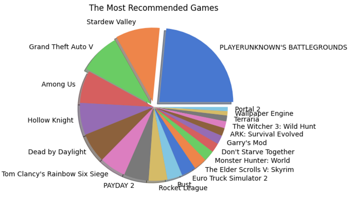
A complete guide to big data analysis using Apache Hadoop (HDFS) and PySpark library in Python on game reviews on the Steam gaming platform.With over 100 zettabytes (= 10¹²GB) of data produced every year around the world, the significance of handling big data is one of the most required skills today. Data Analysis, itself, could be defined as the ability to handle big data and derive insights from the never-ending and exponentially growing data. Apache Hadoop and Apache Spark are two of the basic tools that help us untangle the limitless possibilities hidden in large datasets. Apache Hadoop enables us to streamline data storage and distributed computing with its Distributed File System (HDFS) and the MapReduce-based parallel processing of data. Apache Spark is a big data analytics engine capable of EDA, SQL analytics, Streaming, Machine Learning, and Graph processing compatible with the major programming languages through its APIs. Both when combined form an exceptional environment for dealing with big data with the available computational resources — just a personal computer in most cases!Let us unfold the power of Big Data and Apache Hadoop with a simple analysis project implemented using Apache Spark in Python.To begin with, let's dive into the installation of Hadoop Distributed File System and Apache Spark on a MacOS. I am using a MacBook Air with macOS Sonoma with an M1 chip.Jump to the section —Installing Hadoop Distributed File SystemInstalling Apache SparkSteam Review Analysis using PySparkWhat next?1. Installing Hadoop Distributed File SystemThanks to Code With Arjun for the amazing article that helped me with the installation of Hadoop on my Mac. I seamlessly installed and ran Hadoop following his steps which I will show you here as well.a. Installing HomeBrewI use Homebrew for installing applications on my Mac for ease. It can be directly installed on the system with the below code —/bin/bash -c "$(curl -fsSL https://raw.githubusercontent.com/Homebrew/install/HEAD/install.sh)"Once it is installed, you can run the simple code below to verify the installation.brew --versionFigure 1: Image by AuthorHowever, you will likely encounter an error saying, command not found, this is because the homebrew will be installed in a different location (Figure 2) and it is not executable from the current directory. For it to function, we add a path environment variable for the brew, i.e., adding homebrew to the .bash_profile.Figure 2: Image by AuthorYou can avoid this step by using the full path to Homebrew in your commands, however, it might become a hustle at later stages, so not recommended!echo ‘eval “$(/opt/homebrew/bin/brew shellenv)”' >> /Users/rindhujajohnson/.bash_profileeval “$(/opt/homebrew/bin/brew shellenv)”Now, when you try, brew --version, it should show the Homebrew version correctly.b. Installing HadoopDisclaimer! Hadoop is a Java-based application and is supported by a Java Development Kit (JDK) version older than 11, preferably 8 or 11. Install JDK before continuing.Thanks to Code With Arjun again for this video on JDK installation on MacBook M1.https://medium.com/media/978a938e8d7a981d1b79b65db7884829/hrefNow, we install the Hadoop on our system using the brew command.brew install hadoopThis command should install Hadoop seamlessly. Similar to the steps followed while installing HomeBrew, we should edit the path environment variable for Java in the Hadoop folder. The environment variable settings for the installed version of Hadoop can be found in the Hadoop folder within HomeBrew. You can use which hadoop command to find the location of the Hadoop installation folder. Once you locate the folder, you can find the variable settings at the below location. The below command takes you to the required folder for editing the variable settings (Check the Hadoop version you installed to avoid errors).cd /opt/homebrew/Cellar/hadoop/3.3.6/libexec/etc/hadoopYou can view the files in this folder using the ls command. We will edit the hadoop-env.sh to enable the proper running of Hadoop on the system.Figure 3: Image by AuthorNow, we have to find the path variable for Java to edit the hadoop-ev.sh file using the following command./usr/libexec/java_homeFigure 4: Image by AuthorWe can open the hadoop-env.sh file in any text editor. I used VI editor, you can use any editor for the purpose. We can copy and paste the path — Library/Java/JavaVirtualMachines/adoptopenjdk-11.jdk/Contents/Home at the export JAVA_HOME = position.Figure 5: hadoop-env.sh file opened in VI Text EditorNext, we edit the four XML files in the Hadoop folder.core-site.xml<configuration> <property> <name>fs.defaultFS</name> <value>hdfs://localhost:9000</value> </property></configuration>hdfs-site.xml<configuration> <property> <name>dfs.replication</name> <value>1</value> </property></configuration>mapred-site.xml<configuration> <property> <name>mapreduce.framework.name</name> <value>yarn</value> </property> <property> <name>mapreduce.application.classpath</name> <value>$HADOOP_MAPRED_HOME/share/hadoop/mapreduce/*:$HADOOP_MAPRED_HOME/share/hadoop/mapreduce/lib/* </value> </property></configuration>yarn-site.xml<configuration> <property> <name>yarn.nodemanager.aux-services</name> <value>mapreduce_shuffle</value> </property> <property> <name>yarn.nodemanager.env-whitelist</name> <value>JAVA_HOME,HADOOP_COMMON_HOME,HADOOP_HDFS_HOME,HADOOP_CONF_DIR,CLASSPATH_PREPEND_DISTCACHE,HADOOP_YARN_HOME,HADOOP_MAPRED_HOME </value> </property></configuration>With this, we have successfully completed the installation and configuration of HDFS on the local. To make the data on Hadoop accessible with Remote login, we can go to Sharing in the General settings and enable Remote Login. You can edit the user access by clicking on the info icon.Figure 6: Enable Remote Access. Image by AuthorLet's run Hadoop!Execute the following commandshadoop namenode -format # starts the Hadoop environment% start-all.sh # Gathers all the nodes functioning to ensure that the installation was successful% jps Figure 7: Initiating Hadoop and viewing the nodes and resources running. Image by AuthorWe are all set! Now let's create a directory in HDFS and add the data will be working on. Let's quickly take a look at our data source and details.DataThe Steam Reviews Dataset 2021 (License: GPL 2) is a collection of reviews from about 21 million gamers covering over 300 different games in the year 2021. the data is extracted using Steam's API — Steamworks — using the Get List function.GET store.steampowered.com/appreviews/<appid>?json=1The dataset consists of 23 columns and 21.7 million rows with a size of 8.17 GB (that is big!). The data consists of reviews in different languages and a boolean column that tells if the player recommends the game to other players. We will be focusing on how to handle this big data locally using HDFS and analyze it using Apache Spark in Python using the PySpark library.c. Uploading Data into HDFSFirstly, we create a directory in the HDFS using the mkdir command. It will throw an error if we try to add a file directly to a non-existing folder.hadoop fs -mkdir /userhadoop fs - mkdir /user/steam_analysisNow, we will add the data file to the folder steam_analysis using the put command.hadoop fs -put /Users/rindhujajohnson/local_file_path/steam_reviews.csv /user/steam_analysisApache Hadoop also uses a user interface available at http://localhost:9870/.Figure 8: HDFS User Interface at localhost:9870. Image by AuthorWe can see the uploaded files as shown below.Figure 10: Navigating files in HDFS. Image by AuthorOnce the data interaction is over, we can use stop-all.sh command to stop all the Apache Hadoop daemons.Let us move to the next step — Installing Apache Spark2. Installing Apache SparkApache Hadoop takes care of data storage (HDFS) and parallel processing (MapReduce) of the data for faster execution. Apache Spark is a multi-language compatible analytical engine designed to deal with big data analysis. We will run the Apache Spark on Python in Jupyter IDE.After installing and running HDFS, the installation of Apache Spark for Python is a piece of cake. PySpark is the Python API for Apache Spark that can be installed using the pip method in the Jupyter Notebook. PySpark is the Spark Core API with its four components — Spark SQL, Spark ML Library, Spark Streaming, and GraphX. Moreover, we can access the Hadoop files through PySpark by initializing the installation with the required Hadoop version.# By default, the Hadoop version considered will be 3 here.PYSPARK_HADOOP_VERSION=3 pip install pysparkLet's get started with the Big Data Analytics!3. Steam Review Analysis using PySparkSteam is an online gaming platform that hosts over 30,000 games streaming across the world with over 100 million players. Besides gaming, the platform allows the players to provide reviews for the games they play, a great resource for the platform to improve customer experience and for the gaming companies to work on to keep the players on edge. We used this review data provided by the platform publicly available on Kaggle.3. a. Data Extraction from HDFSWe will use the PySpark library to access, clean, and analyze the data. To start, we connect the PySpark session to Hadoop using the local host address.from pyspark.sql import SparkSessionfrom pyspark.sql.functions import *# Initializing the Spark Sessionspark = SparkSession.builder.appName("SteamReviewAnalysis").master("yarn").getOrCreate()# Providing the url for accessing the HDFSdata = "hdfs://localhost:9000/user/steam_analysis/steam_reviews.csv"# Extracting the CSV data in the form of a Schemadata_csv = spark.read.csv(data, inferSchema = True, header = True)# Visualize the structure of the Schemadata_csv.printSchema()# Counting the number of rows in the datasetdata_csv.count() # 40,848,6593. b. Data Cleaning and Pre-ProcessingWe can start by taking a look at the dataset. Similar to the pandas.head() function in Pandas, PySpark has the SparkSession.show() function that gives a glimpse of the dataset.Before that, we will remove the reviews column in the dataset as we do not plan on performing any NLP on the dataset. Also, the reviews are in different languages making any sentiment analysis based on the review difficult.# Dropping the review column and saving the data into a new variabledata = data_csv.drop("review")# Displaying the datadata.show() Figure 11: The Structure of the SchemaWe have a huge dataset with us with 23 attributes with NULL values for different attributes which does not make sense to consider any imputation. Therefore, I have removed the records with NULL values. However, this is not a recommended approach. You can evaluate the importance of the available attributes and remove the irrelevant ones, then try imputing data points to the NULL values.# Drops all the records with NULL valuesdata = data.na.drop(how = "any")# Count the number of records in the remaining datasetdata.count() # 16,876,852We still have almost 17 million records in the dataset!Now, we focus on the variable names of the dataset as in Figure 11. We can see that the attributes have a few characters like dot(.) that are unacceptable as Python identifiers. Also, we change the data type of the date and time attributes. So we change these using the following code —from pyspark.sql.types import *from pyspark.sql.functions import from_unixtime# Changing the data type of each columns into appropriate typesdata = data.withColumn("app_id",data["app_id"].cast(IntegerType())). withColumn("author_steamid", data["author_steamid"].cast(LongType())). withColumn("recommended", data["recommended"].cast(BooleanType())). withColumn("steam_purchase", data["steam_purchase"].cast(BooleanType())). withColumn("author_num_games_owned", data["author_num_games_owned"].cast(IntegerType())). withColumn("author_num_reviews", data["author_num_reviews"].cast(IntegerType())). withColumn("author_playtime_forever", data["author_playtime_forever"].cast(FloatType())). withColumn("author_playtime_at_review", data["author_playtime_at_review"].cast(FloatType()))# Converting the time columns into timestamp data typedata = data.withColumn("timestamp_created", from_unixtime("timestamp_created").cast("timestamp")). withColumn("author_last_played", from_unixtime(data["author_last_played"]).cast(TimestampType())). withColumn("timestamp_updated", from_unixtime(data["timestamp_updated"]).cast(TimestampType()))Figure 12: A glimpse of the Steam review Analysis dataset. Image by AuthorThe dataset is clean and ready for analysis!3. c. Exploratory Data AnalysisThe dataset is rich in information with over 20 variables. We can analyze the data from different perspectives. Therefore, we will be splitting the data into different PySpark data frames and caching them to run the analysis faster.# Grouping the columns for each analysiscol_demo = ["app_id", "app_name", "review_id", "language", "author_steamid", "timestamp_created" ,"author_playtime_forever","recommended"]col_author = ["steam_purchase", 'author_steamid', "author_num_games_owned", "author_num_reviews", "author_playtime_forever", "author_playtime_at_review", "author_last_played","recommended"]col_time = [ "app_id", "app_name", "timestamp_created", "timestamp_updated", 'author_playtime_at_review', "recommended"]col_rev = [ "app_id", "app_name", "language", "recommended"]col_rec = ["app_id", "app_name", "recommended"]# Creating new pyspark data frames using the grouped columnsdata_demo = data.select(*col_demo)data_author = data.select(*col_author)data_time = data.select(*col_time)data_rev = data.select(*col_rev)data_rec = data.select(*col_rec)i. Games AnalysisIn this section, we will try to understand the review and recommendation patterns for different games. We will consider the number of reviews analogous to the popularity of the game and the number of True recommendations analogous to the gamer's preference for the game.Finding the Most Popular Games# the data frame is grouped by the game and the number of occurrences are countedapp_names = data_rec.groupBy("app_name").count()# the data frame is ordered depending on the count for the highest 20 gamesapp_names_count = app_names.orderBy(app_names["count"].desc()).limit(20)# a pandas data frame is created for plottingapp_counts = app_names_count.toPandas()# A pie chart is createdfig = plt.figure(figsize = (10,5))colors = sns.color_palette("muted")explode = (0.1,0.075,0.05,0,0,0,0,0,0,0,0,0,0,0,0,0,0,0,0,0)plt.pie(x = app_counts["count"], labels = app_counts["app_name"], colors = colors, explode = explode, shadow = True)plt.title("The Most Popular Games")plt.show()Finding the Most Recommended Games# Pick the 20 highest recommended games and convert it in to pandas data frametrue_counts = data_rec.filter(data_rec["recommended"] == "true").groupBy("app_name").count()recommended = true_counts.orderBy(true_counts["count"].desc()).limit(20)recommended_apps = recommended.toPandas()# Pick the games such that both they are in both the popular and highly recommended listtrue_apps = list(recommended_apps["app_name"])true_app_counts = data_rec.filter(data_rec["app_name"].isin(true_apps)).groupBy("app_name").count()true_app_counts = true_app_counts.orderBy(true_app_counts["count"].desc())true_app_counts = true_app_counts.toPandas()# Evaluate the percent of true recommendations for the top games and sort themtrue_perc = []for i in range(0,20,1): percent = (true_app_counts["count"][i]-recommended_apps["count"][i])/true_app_counts["count"][i]*100 true_perc.append(percent)recommended_apps["recommend_perc"] = true_percrecommended_apps = recommended_apps.sort_values(by = "recommend_perc", ascending = False)# Built a pie chart to visualizefig = plt.figure(figsize = (10,5))colors = sns.color_palette("muted")explode = (0.1,0.075,0.05,0,0,0,0,0,0,0,0,0,0,0,0,0,0,0,0,0)plt.pie(x = recommended_apps["recommend_perc"], labels = recommended_apps["app_name"], colors = colors, explode = explode, shadow = True)plt.title("The Most Recommended Games")plt.show()Figure 13: Shows the pie charts for popular and recommended games. Images by AuthorInsightsPlayer Unknown's Battlegrounds (PUBG) is the most popular and most recommended game of 2021.However, the second positions for the two categories are held by Grand Theft Auto V (GTA V) and Stardew Valley respectively. This shows that being popular does not mean all the players recommend the game to another player.The same pattern is observed with other games also. However, the number of reviews for a game significantly affects this trend.ii. Demographic AnalysisWe will find the demography, especially, the locality of the gamers using the data_demo data frame. This analysis will help us understand the popular languages used for review and languages used by reviewers of popular games. We can use this trend to determine the demographic influence and sentiments of the players to be used for recommending new games in the future.Finding Popular Review Languages# We standardize the language names in the language column, then group them,# Count by the groups and convert into pandas df after sorting them the countauthor_lang = data_demo.select(lower("language").alias("language")) .groupBy("language").count().orderBy(col("count").desc()). limit(20).toPandas()# Plotting a bar graphfig = plt.figure(figsize = (10,5))plt.bar(author_lang["language"], author_lang["count"])plt.xticks(rotation = 90)plt.xlabel("Popular Languages")plt.ylabel("Number of Reviews (in Millions)")plt.show()Finding Review Languages of Popular Games# We group the data frame based on the game and language and count each occurrencedata_demo_new = data_demo.select(lower("language"). alias("language"), "app_name")games_lang = data_demo_new.groupBy("app_name","language").count().orderBy(col("count").desc()).limit(100).toPandas()# Plot a stacked bar graph to visualizegrouped_games_lang = games_lang_df.pivot(index='app_name', columns='language', values='count')grouped_games_lang.plot(kind='bar', stacked=True, figsize=(12, 6))plt.title('Count of Different App Names and Languages')plt.xlabel('App Name')plt.ylabel('Count')plt.show()Figure 14: Language Popularity; Language Popularity among Popular games. Images by AuthorInsightsEnglish is the most popular language used by reviewers followed by Schinese and RussianSchinese is the most widely used language for the most popular game (PUBG), whereas, English is widely used for the second most popular game (GTA V) and almost all others!The popularity of a game seems to have roots in the area of origin. PUBG is a product of a South Korean gaming company and we observe that it has the Korean language among one of the highly used.Time, author, and review analyses are also performed on this data, however, do not give any actionable insights. Feel free to visit the GitHub repository for the full project documentation.3. d. Game Recommendation using Spark ML LibraryWe have reached the last stage of this project, where we will implement the Alternating Least Squares (ALS) machine-learning algorithm from the Spark ML Library. This model utilizes the collaborative filtering technique to recommend games based on player's behavior, i.e., the games they played before. This algorithm identifies the game selection pattern for players who play each available game on the Steam App.For the algorithm to work,We require three variables — the independent variable, target variable(s) — depending on the number of recommendations, here 5, and a rating variable.We encode the games and the authors to make the computation easier. We also convert the booleanrecommended column into a rating column with True = 5, and False = 1.Also, we will be recommending 5 new games for each played game and therefore we consider the data of the players who have played more than five for modeling the algorithm.Let's jump to the modeling and recommending part!new_pair_games = data_demo.filter(col("author_playtime_forever")>=5*mean_playtime)new_pair_games = new_pair_games.filter(new_pair_games["author_steamid"]>=76560000000000000).select("author_steamid","app_id", "app_name","recommended")# Convert author_steamid and app_id to indices, and use the recommended column for ratingauthor_indexer = StringIndexer(inputCol="author_steamid", outputCol="author_index").fit(new_pair_games)app_indexer = StringIndexer(inputCol="app_name", outputCol="app_index").fit(new_pair_games)new_pair_games = new_pair_games.withColumn("Rating", when(col("recommended") == True, 5).otherwise(1))# We apply the indexing to the data frame by invoking the reduce phase function transform()new_pair = author_indexer.transform(app_indexer.transform(new_pair_games))new_pair.show()# The reference chart for gamesgames = new_pair.select("app_index","app_name").distinct().orderBy("app_index")Figure 16: The game list with the corresponding index for reference. Image by AuthorImplementing ALS Algorithm# Create an ALS (Alternating Least Squares) modelals = ALS(maxIter=10, regParam=0.01, userCol="app_index", itemCol="author_index", ratingCol="Rating", coldStartStrategy="drop")# Fit the model to the datamodel = als.fit(new_pair)# Generate recommendations for all itemsapp_recommendations = model.recommendForAllItems(5) # Number of recommendations per item# Display the recommendationsapp_recommendations.show(truncate=False)Figure 17: The recommendation and rating generated for each author based on their gaming history. Image by AuthorWe can cross-match the indices from Figure 16 to find the games recommended for each player. Thus, we implemented a basic recommendation system using the Spark Core ML Library.3. e. ConclusionIn this project, we could successfully implement the following —Download and install the Hadoop ecosystem — HDFS and MapReduce — to store, access, and extract big data efficiently, and implement big data analytics much faster using a personal computer.Install the Apache Spark API for Python (PySpark) and integrate it with the Hadoop ecosystem, enabling us to carry out big data analytics and some machine-learning operations.The games and demographic analysis gave us some insights that can be used to improve the gaming experience and control the player churn. Keeping the players updated and informed about the trends in their peers should be a priority for the Steam platform. Suggestions like “most played”, “most played in your region”, “most recommended”, and “don't miss out on these new games” can keep the players active.The Steam Application can use the ALS recommendation system to recommend new games to existing players based on their profile and keep them engaged and afresh.4. What Next?Implement Natural Language Processing techniques in the review column, for different languages to extract the essence of the reviews and improve the gaming experience.Steam can report bugs in the games based on the reviews. Developing an AI algorithm that captures the review content, categorizes it, and sends it to appropriate personnel could do wonders for the platform.Comment what you think can be done more!5. ReferencesApache Hadoop. Apache Hadoop. Apache HadoopStatista. (2021). Volume of data/information created, captured, copied, and consumed worldwide from 2010 to 2020, with forecasts from 2021 to 2025 statistaDey, R. (2023). A Beginner's Guide to Big Data and Hadoop Distributed File System (HDFS). MediumCode with Arjun (2021). Install Hadoop on Mac OS (MacBook M1). MediumApache Spark. PySpark Installation. Apache SparkApache Spark. Collaborative Filtering with ALS). Apache SparkLet's Uncover it. (2023). PUBG. Let's Uncover ItYou can find the complete big data analysis project in my GitHub repository.Let's connect on LinkedIn and discuss more!If you found this article useful, clap, share, and comment!Apache Hadoop and Apache Spark for Big Data Analysis was originally published in Towards Data Science on Medium, where people are continuing the conversation by highlighting and responding to this story.
Apache Hadoop and Apache Spark for Big Data Analysis...
A complete guide to big data analysis using Apache Hadoop (HDFS) and PySpark library...
Source: Towards Data Science
PCA & K-Means for Traffic Data in Python

Reduce dimensionality and cluster Taipei MRT stations based on hourly trafficTaipei Rail Map ( Actually Introduced Romanization Standards based ) Including THSR, TRA, Taipei MRT & Other Lines. Image by Taiwan J.Principal Component Analysis (PCA) has been used in traffic data to detect anomalies, but it can also be used to capture the patterns of a transit station's traffic history, just like what it does on the purchase data of a customer.In this article, we will go through:What tricks does PCA doWhat can we do after applying PCAPlaytime! Take a look into our dataset: Taipei Metro Rapid Transit System, Hourly Traffic DataUsing PCA on hourly traffic dataClustering on the PCA resultInsights on the Taipei MRT trafficKey takeaways1. What tricks does PCA doIn brief, PCA summarizes the data by finding linear combinations of features, which can be thought of as taking several pictures of an 3D object, and it will naturally sort the pictures by the most representative to the least before handing to you.WIth the input being our original data, there would be 2 useful outputs of PCA: Z and W. By multiply them, we can get the reconstruction data, which is the original data but with some tolerable information loss (since we have reduced the dimensionality.)We will explain these 2 output matrices with our data in the practice below.2. What can we do after applying PCAAfter apply PCA to our data to reduce the dimensionality, we can use it for other machine learning tasks, such as clustering, classification, and regression.In the case of Taipei MRT later in this artical, we will perform clustering on the lower dimensional data, where a few dimensions can be interpreted as passenger proportions in different parts of a day, such as morning, noon, and evening. Those stations share similar proportions of passengers in the daytime would be consider to be in the same cluster (their patterns are alike!).3. Take a look in our traffic dataset!The datast we use here is Taipei Metro Rapid Transit System, Hourly Traffic Data, with columns: date, hour, origin, destination, passenger_count.In our case, I will keep weekday data only, since there are more interesting patterns between different stations during weekdays, such as stations in residential areas may have more commuters entering in the daytime, while in the evening, those in business areas may have more people getting in.Stations in residential areas may have more commuters entering in the daytime.The plot above is 4 different staitons' hourly traffic trend (the amount the passengers entering into the station). The 2 lines in red are Xinpu and Yongan Market, which are actually located in the super crowded areas in New Taipei City. On the otherhands, the 2 lines in blue are Taipei City Hall and Zhongxiao Fuxing, where most of the companies located and business activities happen.The trends reflect both the nature of these areas and stations, and we can notice that the difference is most obvious when comparing their trends during commute hours (7 to 9 a.m., and 17 to 19 p.m.).4. Using PCA on hourly traffic dataWhy reducing dimensionality before conducting further machine learning tasks?There are 2 main reasons:As the number of dimensions increases, the distance between any two data points becomes closer, and thus more similar and less meaningful, which would be refered to as “the curse of dimensionality”.Due to the high-dimensional nature of the traffic data, it is difficult to visualize and interpret.By applying PCA, we can identify the hours when the traffic trends of different stations are most obvious and representative. Intuitively, by the plot shown previously, we can assume that hours around 8 a.m. and 18 p.m. may be representative enough to cluster the stations.Remember we mentioned the useful output matrices, Z and W, of PCA in the previous section? Here, we are going to interpret them with our MRT case.Original data, XIndex : starionsColumn : hoursValues : the proportion of passenger entering in the specific hour (#passenger / #total passengers)With such X, we can apply PCA by the following code:from sklearn.decomposition import PCAn_components = 3pca = PCA(n_components=n_components)X_tran = StandardScaler().fit_transform(X)pca = PCA(n_components=n_components, whiten=True, random_state=0)pca.fit(X_tran)Here, we specify the parameter n_components to be 3, which implies that PCA will extract the 3 most significant components for us.Note that, it is like “taking several pictures of an 3D object, and it will sort the pictures by the most representative to the least,” and we choose the top 3 pictures. So, if we set n_components to be 5, we will get 2 more pictures, but our top 3 will remain the same!PCA output, W matrixW can be thought of as the weights on each features (i.e. hours) with regard to our “pictures”, or more specificly, principal components.pd.set_option('precision', 2)W = pca.components_W_df = pd.DataFrame(W, columns=hour_mapper.keys(), index=[f'PC_{i}' for i in range(1, n_components+1)])W_df.round(2).style.background_gradient(cmap='Blues')For our 3 principal components, we can see that PC_1 weights more on night hours, while PC_2 weights more on noon, and PC_3 is about morning time.PCA output, Z matrixWe can interpret Z matrix as the representations of stations.Z = pca.fit_transform(X)# Name the PCs according to the insights on W matrixZ_df = pd.DataFrame(Z, index=origin_mapper.keys(), columns=['Night', 'Noon', 'Morning'])# Look at the stations we demonstrated earlierZ_df = Z_df.loc[['Zhongxiao_Fuxing', 'Taipei_City_Hall', 'Xinpu', 'Yongan_Market'], :]Z_df.style.background_gradient(cmap='Blues', axis=1)In our case, as we have interpreted the W matrix and understand the latent meaning of each components, we can assign the PCs with names.The Z matrix for these 4 stations indicates that the first 2 stations have larger proportion of night hours, while the other 2 have more in the mornings. This distribution also seconds the findings in our EDA (recall the line chart of these 4 stations in the earlier part).5. Clustering on the PCA result with K-MeansAfter getting the PCA result, let's further cluster the transit stations according to their traffic patterns, which is represented by 3principal components.In the last section, Z matrix has representations of stations with regard to night, noon, and morning.We will cluster the stations based on these representations, such that the stations in the same group would have similar passenger distributions among these 3 periods.There are bunch of clustering methods, such as K-Means, DBSCAN, hierarchical clustering, e.t.c. Since the main topic here is to see the convenience of PCA, we will skip the process of experimenting which method is more suitable, and go with K-Means.from sklearn.cluster import KMeans# Fit Z matrix to K-Means model kmeans = KMeans(n_clusters=3)kmeans.fit(Z)After fitting the K-Means model, let's visualize the clusters with 3D scatter plot by plotly.import plotly.express as pxcluster_df = pd.DataFrame(Z, columns=['PC1', 'PC2', 'PC3']).reset_index()# Turn the labels from integers to strings, # such that it can be treated as discrete numbers in the plot.cluster_df['label'] = kmeans.labels_cluster_df['label'] = cluster_df['label'].astype(str)fig = px.scatter_3d(cluster_df, x='PC1', y='PC2', z='PC3', color='label', hover_data={"origin": (pca_df['index'])}, labels={ "PC1": "Night", "PC2": "Noon", "PC3": "Morning", }, opacity=0.7, size_max=1, width = 800, height = 500 ).update_layout(margin=dict(l=0, r=0, b=0, t=0) ).update_traces(marker_size = 5)6. Insights on the Taipei MRT traffic — Clustering resultsCluster 0 : More passengers in daytime, and therefore it may be the “living area” group.Cluster 2 : More passengers in evening, and therefore it may be the “business area” group.Cluster 1 : Both day and night hours are full of people entering the stations, and it is more complicated to explain the nature of these stations, for there could be variant reasons for different stations. Below, we will take a look into 2 extreme cases in this cluster.For example, in Cluster 1, the station with the largest amount of passengers, Taipei Main Station, is a huge transit hub in Taipei, where commuters are allowed to transfer from buses and railway systems to MRT here. Therefore, the high-traffic pattern during morning and evening is clear.On the contrary, Taipei Zoo station is in Cluster 1 as well, but it is not the case of “both day and night hours are full of people”. Instead, there is not much people in either of the periods because few residents live around that area, and most citizens seldom visit Taipei Zoo on weekdays.The patterns of these 2 stations are not much alike, while they are in the same cluster. That is, Cluster 1 might contain too many stations that are actually not similar. Thus, in the future, we would have to fine-tune hyper-parameters of K-Means, such as the number of clusters, and methods like silhouette score and elbow method would be helpful.ConclusionIn summary,Applying PCA on traffic data to reduce dimensionality can be implemented as extracting 3 important periods (morning, noon, evening) from totally 21 working hours.PCA outputs are W and Z matrices, where Z can be viewed as the representations of stations with regard to principal components (time periods), and W can be thought of as the representations of principal components (time periods) with regard to original features (hours).Considering W matrix can help us understand the latent meaning of each principal component.Clustering methods can be used on the PCA output, Z matrix.Note that we skipped EDA and hyper-parameters tuning here in order to focus on the topic of this article, but they are actually important.Thank you for reading so far! Hope you have a wonderful online journey in Taipei 🫶Further ReadingsKMeans Hyper-parameters Explained with Examples, Sujeewa Kumaratunga PhDHow to Combine PCA and K-means Clustering in Python?, Elitsa KaloyanovaReferenceDSCI 563 Lecture Notes, UBC Master of Data Science, Varada KolhatkarK Means Clustering on High Dimensional Data., shivangi singhCurse of Dimensionality — A “Curse” to Machine Learning, Shashmi KaranamUnless otherwise noted, all images are by the author.PCA & K-Means for Traffic Data in Python was originally published in Towards Data Science on Medium, where people are continuing the conversation by highlighting and responding to this story.
PCA & K-Means for Traffic Data in Python
Reduce dimensionality and cluster Taipei MRT stations based on hourly trafficTaipei...
Source: Towards Data Science
Decoding Writing Success on Medium
A data-driven approachContinue reading on Towards Data Science »
Decoding Writing Success on Medium
A data-driven approachContinue reading on Towards Data Science »
Source: Towards Data Science
Understanding Kolmogorov–Arnold Networks (KAN)
Why KANs are a potential alternative to MPLs and the current landscape of Machine Learning. Let’s go through the paper to find out.Continue reading on Towards Data Science »
Understanding Kolmogorov–Arnold Networks (KAN)
Why KANs are a potential alternative to MPLs and the current landscape of Machine...
Source: Towards Data Science
Demo AI Products Like a Pro
An intro to expert guide on using Gradio to demonstrate product value to expert and non-technical audiences.Photo by Austin Distel on UnsplashWe have all experienced at least one demo that has fallen flat. This is particularly a problem in data science, a field where a lot can go wrong on the day. Data scientists often have to balance challenges when presenting to audiences with varying experience levels. It can be challenging to both show the value and explain core concepts of a solution to a wide audience.This article aims to help overcome the hurdles and help you share your hard work! We always work so hard to improve models, process data, and configure infrastructure. It's only fair that we also work hard to make sure others see the value in that work. We will explore using the Gradio tool to share AI products. Gradio is an important part of the Hugging Face ecosystem. It's also used by Google, Amazon and Facebook so you'll be in great company! Whilst we will use Gradio, a lot of the key concepts can be replicated in common alternatives like StreamLit with Python or Shiny with R.The importance of stakeholder/customer engagement in data scienceThe first challenge when pitching is ensuring that you are pitching at the right level. To understand how your AI model solves problems, customers first need to understand what it does, and what the problems are. They may have a PhD in data science, or they may never have heard of a model before. You don't need to teach them linear algebra nor should you talk through a white paper of your solution. Your goal is to convey the value added by your solution, to all audiences.This is where a practical demo comes in. Gradio is a lightweight open source package for making practical demos [1]. It is well documented that live demos can feel more personal, and help to drive conversation/generate new leads [2]. Practical demos can be crucial in building trust and understanding with new users. Trust builds from seeing you use the tool, or even better testing with your own inputs. When users can demo the tool they know there is no “Clever Hans” [3] process going on and what they see is what they get. Understanding grows from users seeing the “if-this-then-that” patterns in how your solution operates.Then comes the flipside … everyone has been to a bad live demo. We have all sat through or made others sit through technical difficulties.But technical difficulties aren't the only thing that give us reason to fear live demos. Some other common off-putting factors are:Information dumping: Pitching to customers should never feel like a lecture. Adding demos that are inaccessible can give customers too much to learn too quickly.Developing a demo: Demos can be slow to build and actually slow down development. Regularly feeding back in “show and tells” is a particular problem for agile teams. Getting content for the show and tell can be an ordeal. Especially if customers grow accustomed to a live demo.Broken dependencies: If you are responsible for developing a demo you might rely on some things staying constant. If they change you'll need to start again.Introducing GradioNow to the technical part. Gradio is a framework for demonstrating machine learning/AI models and it integrates with the rest of the Hugging Face ecosystem. The framework can be implemented using Python or JavaScript SDKs. Here, we will use Python. Before we build a demo an example Gradio app for named entity recognition is below:Image Source: Hugging Face Documentation [4]You can implement Gradio anywhere you currently work, and this is a key benefit of using the framework. If you are quickly prototyping code in a notebook and want instant feedback from stakeholders/colleagues you can add a Gradio interface. In my experience of using Gradio, I have implemented in Jupyter and Google Colab notebooks. You can also implement Gradio as a standalone site, through a public link hosted on HuggingFace. We will explore deployment options later.Gradio demos help us solve the problems above, and get us over the fear of the live demo:Information dumping: Gradio provides a simple interface that abstracts away a lot of the difficult information. Customers aren't overloaded with working out how to interact with our tool and what the tool is all at once.Developing a demo: Gradio demos have the same benefits as StreamLit and Shiny. The demo code is simple and builds on top of Python code you have already written for your product. This means you can make changes quickly and get instant feedback. You can also see the demo from the customer point of view.Broken dependencies: No framework will overcome complete project overhauls. Gradio is built to accomodate new data, data types and even new models. The simplicity and range of allowed inputs/outputs, means that Gradio demos are kept quite constant. Not only that but if you have many tools, many customers and many projects the good news is that most of your demo code won't change! You can just swap a text output to an image output and you're all set up to move from LLM to Stable Diffusion!Step-by-step guide to creating a demo using GradioThe practical section of this article takes you from complete beginner to demonstration expert in Gradio. That being said, sometimes less can be more, if you are looking for a really simple demo to highlight the impact of your work by all means, stick to the basics!For more information on alternatives like StreamLit, check out my earlier post:Building Lightweight Geospatial Data Viewers with StreamLit and PyDeckThe basicsLet's start with a Hello World style example so that we can learn more about what makes up a Gradio demo. We have three fundamental components:Input variables: We provide any number of input variables which users can input using toggles, sliders or other input widgets in our demo.Function: The author of the demo makes a function which does the heavy lifting. This is where code changes between demos the most. The function will transform input variables into an output that the user sees. This is where we can call a model, transform data or do anything else we may need.Interface: The interface combines the input variables, input widgets, function and output widgets into one demo.So let's see how that looks in code form:https://medium.com/media/c2f99aeb97c4f43f54b88412c2a1fe67/hrefThis gives us the following demo. Notice how the input and output are both of the text type as we defined above:Image Source: Image by AuthorNow that we understand the basic components of Gradio, let's get a bit more technical.To see how we can apply Gradio to a machine learning problem, we will use the simplest algorithm we can. A linear regression. For the first example. We will build a linear regression using the California House Prices dataset. First, we update the basic code so that the function makes a prediction based on a linear model:https://medium.com/media/4d60931abdedba8a51733ec0abcda48e/hrefThen we update the interface so that the inputs and outputs match what we need. Note that we also use the Number type here as an input:https://medium.com/media/fd9919e0a1254da4b0699c7d588e15d5/hrefThen we hit run and see how it looks:Image Source: Image by AuthorWhy stop now! We can use Blocks in Gradio to make our demos even more complex, insightful and engaging.Controlling the interfaceBlocks are more or less exactly as described. They are the building blocks of Gradio applications. So far, we have only used the higher level Interface wrapper. In the example below we will use blocks which has a slightly different coding pattern. Let's update the last example to use blocks so that we can understand how they work:https://medium.com/media/fc689a04511bbbe8565607946199ada6/hrefInstead of before when we had inputs, function and interface. We have now rolled everything back to its most basic form in Gradio. We no longer set up an interface and ask for it to add number inputs for us! Now we provide each individual Number input and one Number output. Building like this gives us much more control of the display.With this new control over the demo we can even add new tabs. Tabs enable us to control the user flows and experience. We can first explain a concept, like how our predictions are distributed. Then on the next tab, we have a whole new area to let users prompt the model for predictions of their own. We can also use tabs to overcome technical difficulties. The first tab gives users a lot of information about model performance. This is all done through functions that were implemented earlier. If the model code doesn't run on the day we still have something insightful to share. It's not perfect, but it's a lot better than a blank screen!Note: This doesn't mean we can hide technical difficulties behind tabs! We can just use tabs to give audiences something to go on if all else fails. Then reshare the demo when we resolve the technical issues.Image Source: Image by AuthorRamping up the complexity shows how useful Gradio can be to show all kinds of information! So far though we have kept to a pretty simple model. Let's now explore how we would use Gradio for something a bit more complex.Gradio for AI Models and ImagesThe next application will look at using Gradio to demonstrate Generative AI. Once again, we will use Blocks to build the interface. This time the demo will have two core components:An intro tab explaining the limitations, in and out of scope uses of the model.An inspiration tab showing some images generated earlier.An interactive tab where users can submit prompts to generate images.In this blog we will just demo a pre-trained model. To learn more about Stable Diffusion models, including key concepts and fine-tuning, check out my earlier blog:Stable Diffusion: How AI converts text to imagesAs this is a demo, we will start from the most difficult component. This ensures we will have the most time to deliver the hardest piece of work. The interactive tab is likely to be the most challenging, so we will start there. So that we have an idea of what we are aiming for our demo page will end up looking something like this:Image Source: Image by Author. Stable Diffusion Images are AI Generated.To achieve this the demo code will combine the two examples above. We will use blocks, functions, inputs and buttons. Buttons enable us to work in a similar way to before where we have inputs, outputs and functions. We use buttons as event listeners. Event listeners help to control our logic flow.Let's imagine we are trying to start our demo. At runtime (as soon as the demo starts), we have no inputs. As we have no input, the model the demo uses has no prompt. With no prompt, the model cannot generate an image. This will cause an error. To overcome the error we use an event listener. The button listens for an event, in this case, a click of the button. Once it “hears” the event, or gets clicked, it then triggers an action. In this case, the action will be submitting a completed prompt to the model.Let's review some new code that uses buttons and compare it to the previous interface examples:https://medium.com/media/f4ca0fe01b0afafee464de9d6179ff6b/hrefThe button code looks like the interface code, but there are some big conceptual changes:The button code uses blocks. This is because whilst we are using the button in a similar way to interface, we still need something to determine what the demo looks like.Input and output widgets are used as objects instead of strings. If you go back to the first example, our input was “text” of type string but here it is prompt of type gr.Text().We use button.click() instead of Interface.launch(). This is because the interface was our whole demo before. This time the event is the button click.This is how the demo ends up looking:Image Source: Image by Author. Stable Diffusion Images are AI Generated.Can you see how important an event listener is! It has saved us lots of work in trying to make sure things happen in the right order. The beauty of Gradio means we also get some feedback on how long we will have to wait for images. The progress bar and time information on the left are great for user feedback and engagement.The next part of the demo is sharing images we generated beforehand. This will serve as inspiration to customers. They will be able to see what is possible from the tool. For this we will implement another new output widget, a Gallery. The gallery displays the images we just generated:https://medium.com/media/ddeccfda8deea8520f07af18fad9d9e1/hrefAn important note: We actually make use of our generate_images() function from before. As we said above, all of these lightweight app libraries enable us to simply build on top of our existing code.The demo now looks like this, users are able to switch between two core functionalities:Image Source: Image by Author. Stable Diffusion Images are AI Generated.Finally we will tie everything together with a landing page for the demo. In a live or recorded demo the landing page will give us something to talk through. It's useful but not essential. The main reason we include a landing page, is for any users that will test the tool without us being present. This helps to build accessibility of the tool and trust and understanding in users. If you need to be there every time customers use your product, it's not going to deliver value.This time we won't be using anything new. Instead we will show the power of the Markdown() component. You may have noticed we have used some Markdown already. For those familiar, Markdown can help express all kinds of information in text. The code below has some ideas, but for your demos, get creative and see how far you can take Markdown in Gradio:Image Source: Image by AuthorThe finished demo is below. Let me know what you think in the comments!Image Source: Image by Author. Stable Diffusion Images are AI Generated.Sharing with customersWhether you're a seasoned pro, or pitching beginner sharing the demo can be daunting. Building demonstrations and pitching are two very different skillsets. This article so far has helped to build your demo. There are great resources online to help pitching [5]. Let's now focus on the intersection of the two, how you can share the demo you built, effectively.Baring in mind your preferred style, live demo is guaranteed to liven up your pitch (pun intended!). To a technical audience we can set off our demo right in our notebook. This is useful to those who want to get into the code. I recommend sharing this way with new colleagues, senior developers and anyone looking to collaborate or expand your work. If you are using an alternative to Gradio, I'd still recommend sharing your code at a high level with this audience. It can help bring new developers onboard, or explain your latest changes to senior developers.An alternative is to present the live demo using just a “front-end”. This can be done using the link provided when you run the demo. When you share this way customers don't have to get bogged down in code to see your demo. This is how the screenshots so far have been taken. I'd recommend this for live non-technical audiences, new customers and for agile feedback/show and tell sessions. We can get to this using a link provided if you built your demo in Gradio.The link we can use to share also allows us to share the demo with others. By setting a share parameter when we launch the demo:demo.launch(debug=True, share=True)This works well for users who can't make the live session, or want more time to experiment with the product. This link is available for 72 hours. There is a need for caution at this point as demos are hosted publicly from your machine. It is advised that you consider the security aspects of your system before sharing this way. One thing we can do to make this a bit more secure is to share our demo with password protection:demo.launch(debug=True, auth=('trusted_user', 'trusted123'))This adds a password pop-up to the demo.You can take this further by using authorisation techniques. Examples include using Hugging Face directly or Google for OAuth identity providers [6]. Further protections can be put in place for blocked files and file paths on the host machine [6].This does not solve security concerns with sharing this way completely. If you are looking to share privately, containerisation through a cloud provider may be a better option [7].For wider engagement, you may want to share your demo publicly to an online audience. This can be brilliant for finding prospective customers, building word of mouth or getting some feedback on your latest AI project. I have been sharing work publicly for feedback for years on Medium, Kaggle and GitHub. The feedback I have had has definitely improved my work over time.If you are using Gradio demos can be publicly shared through Hugging Face. Hugging Face provides Spaces which are used for sharing Gradio apps. Spaces provide a free platform to share your demo. There are costs attached to GPU instances (ranging from .40 to per hour). To share to spaces, the following documentation is available [6]. The docs explain how you can:Share to spacesImplement CI/CD of spaces with GitHub actionsEmbedding Gradio demos in your own website from spaces!Spaces are helpful for reaching a wider audience, without worrying about resources. It is also a permanent link for prospective customers. It does make it more important to include as much guidance as possible. Again, this is a public sharing platform on compute you do not own. For more secure requirements, containerisation and dedicated hosting may be preferred. A particularly great example is this Minecraft skin generator [8].Image Source: Nick088, Hugging Face [Stable Diffusion Finetuned Minecraft Skin Generator — a Hugging Face Space by Nick088]Additional considerationsThe elephant in the room in the whole AI community right now is of course LLMs. Gradio has plenty of components built with LLM in mind. This includes using agentic workflows and models as a service [9].It is also worth mentioning custom components. Custom components have been developed by other data scientists and developers. They are extensions on top of the Gradio framework. Some great examples are:Image annotation component: gradio_image_annotation V0.0.6 — a Hugging Face Space by edgarggQuestion answering with an uploaded PDF: gradio_pdf V0.0.6 — a Hugging Face Space by awacke1Extensions are not unique to Gradio. If you choose to use StreamLit or Shiny to build your demo there are great extensions to those frameworks as well:StreamLit Extras, an extension of the StreamLit UI components: https://extras.streamlit.app/Awesome R Shiny, additional reactive/UI/theming components for Shiny: https://github.com/nanxstats/awesome-shiny-extensionsA final word on sharing work, in an agile context. When sharing regularly through show and tells or feedback sessions lightweight demos are a game changer. The ability to easily layer on from MVP to final product really helps customers see their journey with your product.In summary, Gradio is a lightweight, open source tool for sharing AI products. Some important security steps may need consideration depending on your requirements. I really hope you are feeling more prepared with your demos!If you enjoyed this article please consider giving me a follow, sharing this article or leaving a comment. I write a range of content across the data science field, so please checkout more on my profile.References[1] Gradio Documentation. https://www.gradio.app/[2] User Pilot Product Demos. https://userpilot.com/blog/product-demos/[3] Clever Hans Wikipedia. https://en.wikipedia.org/wiki/Clever_Hans[4] Gradio Named Entity Recognition App. Named Entity Recognition (gradio.app)[5] Harvard Business Review. What makes a great pitch. What Makes a Great Pitch (hbr.org)[6] Gradio Deploying to Spaces. Sharing Your App (gradio.app).[7] Deploying Gradio to Docker. Deploying Gradio With Docker[8] Amazing Minecraft Skin Generator Example. Stable Diffusion Finetuned Minecraft Skin Generator — a Hugging Face Space by Nick088[9] Gradio for LLM. Gradio And Llm AgentsDemo AI Products Like a Pro was originally published in Towards Data Science on Medium, where people are continuing the conversation by highlighting and responding to this story.
Demo AI Products Like a Pro
An intro to expert guide on using Gradio to demonstrate product value to expert...
Source: Towards Data Science
Text to Knowledge Graph Made Easy with Graph Maker

An open-source library for building knowledge graphs from text corpus using open-source LLMs like Llama 3 and Mixtral.Image generated by the Author using Adobe PhotoshopIn this article, I will share a Python library — the Graph Maker — that can create a Knowledge Graph from a corpus of text as per a given Ontology. The Graph Maker uses open-source LLMs like Llama3, Mistral, Mixtral or Gemma to extract the KG.We will go through the basics of ‘Why' and ‘What' of the Graph Maker, a brief recap of the previous article, and how the current approach addresses some of its challenges. I will share the GitHub repository at the end of this article.IntroductionThis article is a sequel to the article I wrote a few months ago about how to convert any text into a Graph.How to Convert Any Text Into a Graph of ConceptsThe article received an overwhelming response. The GitHub repository shared in the article has more than 180 Forks and more than 900 Stars. The article itself was read by more than 80K readers on the Medium. Recently the article was attributed in the following paper published by Prof Markus J. Buehler at MIT.Accelerating Scientific Discovery with Generative Knowledge Extraction, Graph-Based Representation, and Multimodal Intelligent Graph ReasoningThis is a fascinating paper that demonstrates the gigantic potential of Knowledge Graphs in the era of AI. It demonstrates how KGs can be used, not only to retrieve knowledge but also to discover new knowledge. Here is one of my favourite excerpts from this paper.“For instance, we will show how this approach can relate seemingly disparate concepts such as Beethoven's 9th symphony with bio-inspired materials science”These developments are a big reaffirmation of the ideas I presented in the previous article and encouraged me to develop the ideas further.I also received numerous feedback from fellow techies about the challenges they encountered while using the repository, and suggestions for improving the idea. I incorporated some of these suggestions into a new Python package I share here.Before we discuss the working of the package — The Graph Maker — let us discuss the ‘Why' and the ‘What' of it.A Brief RecapWe should probably start with ‘Why Graphs'. However, We discussed this briefly in my previous article. Feel free to hop onto that article for a refresher. However, let us briefly discuss the key concepts that are relevant to our current discussion here.TL;DR this section if you are already well versed in the lore of Knowledge Graphs.Here is an illustration that sums up the idea of Knowledge Graphs neatly.Source: https://arxiv.org/abs/2403.11996To create a KG, we need two pieces of information.Knowledge Base: This can be a corpus of text, a code base, a collection of articles, etc.Ontology: The categories of the entities, and the types of their relationships we care about. I am probably oversimplifying the definition of ontology here but it works for our purpose.Here is a simple ontologyEntities: Person, PlaceRelationships: Person — related to → PersonPerson — lives in → PlacePerson — visits → PlaceGiven these two pieces of information, we can build a KG from a text that mentions people and places. However, let's say our knowledge base is about a clinical study of prescription drugs and their interactions. We might use a different ontology where Compounds, Usage, Effects, Reactions etc may form our ontology.In the previous article, we discussed How we can extract a Knowledge Graph using an LLM, without supplying it with an ontology. The idea was to let the LLM discover the ontology best suited for the given corpus of text by itself.Although this approach lacks the rigour of the traditional methods of generating KGs, it has its merits. It can generate KGs with unstructured data more easily than traditional methods. The KGs that it generates are, in some sense, also unstructured. However, they are easier to build and are richer in information. They are well suited for GRAG (Graph Retrieval Augmented Generation) like applications.Why The Graph Maker?Let me list a few challenges and observations I received in the feedback for my previous article. It will help us understand the challenges in creating KGs with LLMs. Let us use the Wikipedia summary of the Lord of the Rings books. One cant not love the Lord of the Rings after all!Meaningful EntitiesGiven a free run, the entities that the LLM extracts can be too diverse in their categories. It mistakes by marking abstract concepts as entities. For example in the text “Bilbo Baggins celebrates his birthday and leaves the Ring to Frodo”, the LLM may extract “Bilbo Baggins celebrates his birthday” or “Celebrates his birthday” as ‘Action'. But it may be more useful if it extracts “Birthday” as an ‘Event'.Consistent EntitiesIt can also mistake marking the same entity differently in different contexts. For example:‘Sauron', ‘the Dark Lord Sauron' and ‘the Dark Lord' Should not be extracted as different entities. Or if they are extracted as different entities, they should be connected with an equivalence relationship.Resilience in parsingThe output of the LLMs is, by nature, indeterministic. To extract the KG from a large document, we must split the corpus into smaller text chunks and then generate subgraphs for every chunk. To build a consistent graph, the LLM must output JSON objects as per the given schema consistently for every subgraph. Missing even one may affect the connectivity of the entire graph adversely.Although LLMs are getting better at responding with well-formatted JSON objects, It is still far from perfect. LLMs with limited context windows may also generate incomplete responses.Categorisation of the EntitiesLLMs can error generously when recognising entities. This is a bigger problem when the context is domain-specific, or when the entities are not named in standard English. NER models can do better at that, but they too are limited to the data they are trained on. Moreover, they can't understand the relations between the entities.To coerce an LLM to be consistent with categories is an art in prompt engineering.Implied relationsRelations can be explicitly mentioned, or implied by the context. For example:“Bilbo Baggins celebrates his birthday and leaves the Ring to Frodo” implies the relationships:Bilbo Baggins → Owner → RingBilbo Baggins → heir → FrodoFrodo → Owner → RingHere I think LLMs at some point in time will become better than any traditional method of extracting relationships. But as of now, this is a challenge that needs clever prompt engineering.The Graph MakerThe graph maker library I share here improves upon the previous approach by travelling halfway between the rigour and the ease — halfway between the structure and the lack of it. It does remarkably better than the previous approach I discussed on most of the above challenges.As opposed to the previous approach, where the LLM is free to discover the ontology by itself, the graph maker tries to coerce the LLM to use a user-defined ontology.Here is how it works in 5 easy steps.1. Define the Ontology of your GraphThe library understands the following schema for the Ontology. Behind the scenes, ontology is a pedantic model.ontology = Ontology(# labels of the entities to be extracted. Can be a string or an object, like the following.labels=[{"Person": "Person name without any adjectives, Remember a person may be referenced by their name or using a pronoun"},{"Object": "Do not add the definite article 'the' in the object name"},{"Event": "Event event involving multiple people. Do not include qualifiers or verbs like gives, leaves, works etc."},"Place","Document","Organisation","Action",{"Miscellaneous": "Any important concept can not be categorised with any other given label"},],# Relationships that are important for your application.# These are more like instructions for the LLM to nudge it to focus on specific relationships.# There is no guarantee that only these relationships will be extracted, but some models do a good job overall at sticking to these relations.relationships=["Relation between any pair of Entities",],)I have tuned the prompts to yield results that are consistent with the given ontology. I think it does a pretty good job at it. However, it is still not 100% accurate. The accuracy depends on the model we choose to generate the graph, the application, the ontology, and the quality of the data.2. Split the text into chunks.We can use as large a corpus of text as we want to create large knowledge graphs. However, LLMs have a finite context window right now. So we need to chunk the text appropriately and create the graph one chunk at a time. The chunk size that we should use depends on the model context window. The prompts that are used in this project eat up around 500 tokens. The rest of the context can be divided into input text and output graph. In my experience, smaller chunks of 200 to 500 tokens generate a more detailed graph.3. Convert these chunks into Documents.The document is a pedantic model with the following schema## Pydantic document modelclass Document(BaseModel): text: str metadata: dictThe metadata we add to the document here is tagged to every relation that is extracted out of the document.We can add the context of the relation, for example, the page number, chapter, the name of the article, etc. into the metadata. More often than not, Each node pairs have multiple relations with each other across multiple documents. The metadata helps contextualise these relationships.4. Run the Graph Maker.The Graph Maker directly takes a list of documents and iterates over each of them to create one subgraph per document. The final output is the complete graph of all the documents.Here is a simple example of how to achieve this.from graph_maker import GraphMaker, Ontology, GroqClient## -> Select a groq supported modelmodel = "mixtral-8x7b-32768"# model ="llama3–8b-8192"# model = "llama3–70b-8192"# model="gemma-7b-it" ## This is probably the fastest of all models, though a tad inaccurate.## -> Initiate the Groq Client.llm = GroqClient(model=model, temperature=0.1, top_p=0.5)graph_maker = GraphMaker(ontology=ontology, llm_client=llm, verbose=False)## -> Create a graph out of a list of Documents.graph = graph_maker.from_documents(docs)## result: a list of Edges.print("Total number of Edges", len(graph))## 1503The Graph Makers run each document through the LLM and parse the response to create the complete graph. The final graph is as a list of edges, where every edge is a pydantic model like the following.class Node(BaseModel): label: str name: str class Edge(BaseModel): node_1: Node node_2: Node relationship: str metadata: dict = {} order: Union[int, None] = NoneI have tuned the prompts so they generate fairly consistent JSONs now. In case the JSON response fails to parse, the graph maker also tries to manually split the JSON string into multiple strings of edges and then tries to salvage whatever it can.5. Save to Neo4jWe can save the model to Neo4j either to create an RAG application, run Network algorithms, or maybe just visualise the graph using the Bloomfrom graph_maker import Neo4jGraphModelcreate_indices = Falseneo4j_graph = Neo4jGraphModel(edges=graph, create_indices=create_indices)neo4j_graph.save()Each edge of the graph is saved to the database as a transaction. If you are running this code for the first time, then set the `create_indices` to true. This prepares the database by setting up the uniqueness constraints on the nodes.5.1 Visualise, just for fun if nothing elseIn the previous article, we visualised the graph using networkx and pyvis libraries. Here, because we are already saving the graph to Neo4J, we can leverage Bloom directly to visualise the graph.To avoid repeating ourselves, let us generate a different visualisation from what we did in the previous article.Let's say we like to see how the relations between the characters evolve through the book.We can do this by tracking how the edges are added to the graph incrementally while the graph maker traverses through the book. To enable this, the Edge model has an attribute called ‘order'. This attribute can be used to add a temporal or chronological dimension to the graph.In our example, the graph maker automatically adds the sequence number in which a particular text chunk occurs in the document list, to every edge it extracts from that chunk. So to see how the relations between the characters evolve, we just have to cross section the graph by the order of the edges.Here is an animation of these cross-sections.Animation generated by the AuthorGraph and RAGThe best application of this kind of KG is probably in RAG. There are umpteen articles on Medium on how to augment your RAG applications with Graphs.Essentially Graphs offer a plethora of different ways to retrieve knowledge. Depending on how we design the Graph and our application, some of these techniques can be more powerful than simple semantic search.At the very basic, we can add embedding vectors into our nodes and relationships, and run a semantic search against the vector index for retrieval. However, I feel the real power of the Graphs for RAG applications is when we mix Cypher queries and Network algorithms with Semantic Search.I have been exploring some of these techniques myself. I am hoping to write about them in my next article.The CodeHere is the GitHub Repository. Please feel free to take it for a spin. I have also included an example Python notebook in the repository that can help you get started quickly.Please note that you will need to add your GROQ credentials in the .env file before you can get started.GitHub - rahulnyk/graph_makerInitially, I developed this codebase for a few of my pet projects. I feel it can be helpful for many more applications. If you use this library for your applications, please share it with me. I would love to learn about your use cases.Also if you feel you can contribute to this open source project, please do so and make it your own.I hope you find the graph maker useful. Thanks for reading.I am a learner of architecture (not the buildings… the tech kind). In the past, I have worked with Semiconductor modelling, Digital circuit design, Electronic Interface modelling, and the Internet of Things.Currently, Data and Consumer Analytics @Walmart Keeps me busy.ThanksText to Knowledge Graph Made Easy with Graph Maker was originally published in Towards Data Science on Medium, where people are continuing the conversation by highlighting and responding to this story.
Text to Knowledge Graph Made Easy with Graph Maker
An open-source library for building knowledge graphs from text corpus using open-source...
Source: Towards Data Science
How I Predicted the Effect of Mutations on Protein Interactions Using AlphaFold

Using AlphaFold-Multimer, XGBoost, and 47,000 SLURM jobs to predict PPI outcomes with 91% AUCContinue reading on Towards Data Science »
How I Predicted the Effect of Mutations on Protein...
Using AlphaFold-Multimer, XGBoost, and 47,000 SLURM jobs to predict PPI outcomes...
Source: Towards Data Science
LLMs Pitfalls

An introduction to some of the key components surrounding LLMs to produce production-grade applicationsContinue reading on Towards Data Science »
LLMs Pitfalls
An introduction to some of the key components surrounding LLMs to produce production-grade...
Source: Towards Data Science
5 Things to do When Evaluating ELT/ETL Tools
A list to make evaluating ELT/ETL tools a bit less dauntingPhoto by Volodymyr Hryshchenko on UnsplashWe've all been there: you've attended (many!) meetings with sales reps from all of the SaaS data integration tooling companies and are granted 14 day access to try their wares. Now you have to decide what sorts of things to test in order to figure out definitively if the tool is the right commitment for you and the team.I wanted to throw together some notes on key evaluation questions, as well as a few ways to check functionality, as I'm confident that this is a process that I will encounter again and again, and I like to have a template for these types of things.These are primarily collected with cloud based integration platforms such as, but not limited to Fivetran, Airbyte, and Rivery in mind, but could apply to other cases as well!If you have a favorite way to test out new data tools, add them to the comments!1. Create a rubricYou can find a million articles on evaluation criteria for data integration tooling (I really like this one!), but ultimately it comes down to your data platform and the problems within it that you are trying to solve.Gather the team together and determine what these things are. There are, of course obvious features like required source and destination connectors that can be deal breakers, but maybe you're also looking for a metadata solution that provides lineage, or trying to increase monitoring, or needing to scale something that was built in house and is no longer holding its own.When you lay all of that out it also makes it easier to divide up the work of making these evaluations across team members to run in parallel.2. Start a simple pipeline running right awayPick something pretty simple and get it up and running on day one. This will help create an overall picture of logging, metadata, latency, CDC, and all the other things that come with a pipeline.If you are lucky you might even run into a platform error over the course of the 14 days and see how that is handled from the tooling company's side. If you are dealing with an open source option, it can also help you understand if you are equipped to manage such issues in house.Key questionsDoes the documentation and UI guide you through setting up permissions and keys, scheduling, schema setup, etc in a way that's intuitive or do you have to reach out to the technical rep for help?If platform errors do occur, are they obvious via logs or is it hard to tell if you or the platform are the problem?How quickly are customers notified, and issues resolved when the platform goes down?3. Create a few end to end transformsSome tools come with built in DBT integrations, some allow for fully custom Python based transformations. Translating a few transforms, maybe even a somewhat complex one, end to end from your existing solution can give you a good idea of how heavy a lift it will be to move everything over, if it is possible at all.Key QuestionsCan you land the data in the same format that it is landing in now, or will it change in ways that majorly impact upstream dependencies?Are there types of transformations that you do prior to landing data that can't be done in the tool (joining in supplemental data sources, parsing messy multi-multi level JSON, etc) that will now have to be done in the database post landing?4. Throw a non-native data source at itTry to process something from a non natively supported source or format (dummy up some fixed width files, or maybe pick an in house tool that exports data out in an unconventional way), or at least talk through how you could, with your technical sales representative. Even if, right now, that's not an issue, if something does come up, it is worthwhile to at least understand what the options are for putting that functionality into place.Key QuestionsWhen a non supported source comes up will you have enough flexibility from the tool to build a solution within its framework?When you start adding custom functionality to the framework does the same logging, error handling, state management, etc apply?5. Force an errorSomewhere along one of the test pipelines that you've built, throw in a badly formatted file, add bad code into a transform, change the schema, or wreak havoc in some other creative way to see what happens.3rd party tools like these can be black boxes in some aspects, and nothing is more frustrating when a pipeline goes down, than incomprehensible error messages.Key questionsDo error messages and logs make it clear what went wrong and where?What happens to the data that was in the pipeline once you put a fix in place? Does anything get lost, or loaded more times than it should have?Are there options to redirect bad data and allow the rest of the pipeline to keep going?A couple of bonusesHave a non-technical user ingest a Google sheetNeeding to integrate data from a manually uploaded spreadsheet is a somewhat more common use case than DE's often like to think that it is. A tool should make this easy for the producing business team to do without the DE's getting involved at all.Read through the Reddit threads on the toolI have found Reddit to be very useful when looking at tooling options. Folks are typically very reasonable in their assessment of positive and negative experiences with a tool, and open to answering questions. At the end of the day even a thorough trial phase will miss things, and this can be an easy way to see if you have some blind spots.5 Things to do When Evaluating ELT/ETL Tools was originally published in Towards Data Science on Medium, where people are continuing the conversation by highlighting and responding to this story.
5 Things to do When Evaluating ELT/ETL Tools
A list to make evaluating ELT/ETL tools a bit less dauntingPhoto by Volodymyr Hryshchenko...
Source: Towards Data Science
L'Intelligence Artificiel et le Big Data
Définitions
Intelligence Artificiel :
L'intelligence artificielle (IA) est un domaine de l'informatique qui vise à créer des systèmes et des machines capables de simuler l'intelligence humaine. L'objectif principal de l'IA est de développer des algorithmes et des modèles qui peuvent effectuer des tâches généralement associées à l'intelligence humaine, telles que la perception, le raisonnement, l'apprentissage, la planification, la prise de décision, la reconnaissance vocale, la compréhension du langage naturel, la résolution de problèmes, etc.
L'intelligence artificielle peut être divisée en deux catégories principales :
- L'intelligence artificielle faible (IA faible) : Également appelée intelligence artificielle étroite, elle se réfère à des systèmes qui sont conçus pour exécuter des tâches spécifiques et limitées. Ces systèmes ne démontrent pas une compréhension générale ou une conscience de soi. Ils sont généralement spécialisés dans une tâche particulière et ne peuvent pas facilement être transférés pour effectuer d'autres tâches.
- L'intelligence artificielle forte (IA forte) : Elle représente une forme d'intelligence artificielle qui est capable de fonctionner avec une compréhension similaire à celle d'un être humain. L'IA forte peut résoudre des problèmes complexes, apprendre de l'expérience, s'adapter à de nouvelles situations et accomplir des tâches variées sans avoir besoin d'être spécifiquement programmée pour chacune d'entre elles. Cependant, l'existence de l'IA forte est un sujet de débat et n'a pas encore été complètement réalisée.
L'une des approches les plus répandues pour mettre en œuvre l'intelligence artificielle est l'apprentissage automatique (machine learning) qui permet aux systèmes informatiques d'apprendre à partir de données, d'identifier des schémas et de prendre des décisions sans une programmation explicite. Les réseaux de neurones artificiels, en particulier les réseaux de neurones profonds (Deep Learning), sont devenus essentiels pour de nombreuses applications d'intelligence artificielle, comme la vision par ordinateur, la reconnaissance vocale et le traitement du langage naturel.
L'intelligence artificielle est utilisée dans une multitude de domaines, tels que la santé, la finance, la logistique, l'automobile, les jeux, la robotique et bien d'autres, offrant des avantages potentiels mais soulevant également des questions éthiques et sociales liées à l'automatisation, à la confidentialité des données, à la sécurité et à l'impact sur l'emploi.
Big Data :
Le "Big Data" (ou mégadonnées en français) est un terme utilisé pour décrire de vastes ensembles de données complexes, massives et souvent hétérogènes, qui dépassent la capacité des outils traditionnels de traitement et de gestion des données pour les analyser de manière efficace. Le Big Data se caractérise généralement par trois "V" :
- Volume : Le Big Data implique une énorme quantité de données, généralement de l'ordre des pétaoctets (10^15 octets) ou plus. Ces données peuvent être collectées à partir de diverses sources, telles que les réseaux sociaux, les appareils connectés à Internet, les capteurs, les appareils mobiles, les transactions commerciales, etc.
- Vitesse : Les données du Big Data sont souvent générées en temps réel ou à un rythme très rapide. Il est crucial de pouvoir traiter, analyser et prendre des décisions basées sur ces données à un rythme rapide pour en tirer un avantage concurrentiel.
- Variété : Les données du Big Data peuvent prendre différentes formes, y compris des données structurées (bases de données relationnelles), semi-structurées (JSON, XML) et non structurées (textes, images, vidéos). La variété des données rend leur traitement et leur analyse plus complexe.
En plus des trois V mentionnés ci-dessus, certains experts ajoutent également deux autres V :
- Vérité (Veracity) : Faire confiance à l'exactitude et à la qualité des données du Big Data peut être un défi. Les données peuvent être incomplètes, erronées ou provenir de sources peu fiables.
- Valeur (Value) : L'objectif ultime du Big Data est de transformer ces données en informations exploitables qui apportent une valeur ajoutée significative aux organisations ou aux individus.
Le Big Data joue un rôle essentiel dans de nombreux domaines, notamment le marketing, la santé, les sciences, la finance, la logistique, les sciences sociales, etc. En exploitant ces vastes quantités de données, les entreprises et les chercheurs peuvent découvrir des tendances, des schémas cachés, prendre des décisions plus éclairées, personnaliser les offres et améliorer l'efficacité opérationnelle. Pour gérer le Big Data, des technologies avancées telles que le calcul distribué, les systèmes de stockage massivement parallèles et les bases de données NoSQL sont utilisées pour faciliter le traitement et l'analyse des mégadonnées.